ShopDreamUp AI ArtDreamUp
Deviation Actions


Suggested Deviants


Suggested Collections


You Might Like…


Featured in Groups


Description
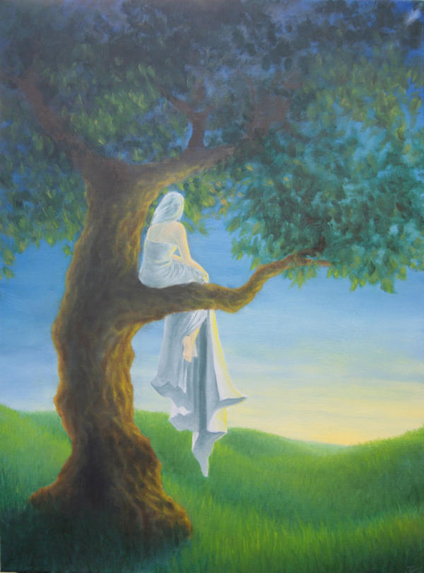
Final project for both Painting and Principles of Illustration. I went into this having decided it was time to produce something better than Oncoming Storm, and decided to quite consciously echo its composition. Further, I also decided that I would make the majority of it involve a color I was not comfortable with (read: not blue or a cool neutral).
I'm very, very proud of it... but this is not my favorite painting. Not yet: it was rushed and it shows. I owe it many more hours, mainly for the tree (which is the weakest part), and the shading on the girl (with is wrong and weak).
Oil on 18"x24" canvas.
~15 hours, ten of which happened in one straight shoot, 6pm-6am. God damn it, finals.
Image size
626x845px 280.67 KB
Make
SONY
Model
DSLR-A230
Shutter Speed
1/8 second
Aperture
F/4.0
Focal Length
20 mm
ISO Speed
400
Date Taken
Apr 30, 2010, 2:33:54 AM
© 2010 - 2024 LaughingAstarael
Comments22
Join the community to add your comment. Already a deviant? Log In
A-OK! Very sorry for the long wait. :c
My first question on this would be- is it a photo of the painting? Some of (but not all of) the colors feel washed out, which could be a result of the photography. If this IS a photo, and the desaturated colors I'm about to mention are more saturated in person, please disregard what I say about them, ha ha.
COMPOSITION
There are some things going on here that I like a lot. If you were trying to convey some sense of solitary longing (but not necessarily sadness), I think that was effective. The character's position in relation to the horizon line pleases me, and I like how the landscape dips down to create a focal point.
I think the leafiness of the tree might be detrimental; it sort of feels like it's just there to fill up space, and doesn't really suggest the shape of the tree's foliage, or mass. I think making some smaller cut-outs in that overall shape (but not disconnecting it totally from the top edge of the picture) might be helpful. Also, if at all possible, consider pulling more of that foliage into the foreground, so the tree doesn't feel so flat on the picture plane.
RENDERING
The image is too small for me to get a good idea of what the rendering is like. It seems to shift from defined to sort of impressionistic in places.
LIGHTING/COLOR
Sub-surface scatter. Learn it, love it. It's your bro. You hold your hand up to a light, and you see how your hand turns red? Light is bouncing around under the surface of your skin, and reflecting color from all those red blood cells back and forth. The lighting on the figure seems like it should be pretty strong; bringing reds and pinks into the transition between the highest highlights and the mitdone can help give the figure a sense of fleshiness, vs. the viewer just assuming it's skin, because they know you meant for it to be skin. I know your palette doesn't appear to include much in the way of reds here, so you may have to improvise with yellows and purples to get a similar effect.
The tree has a pretty strong shadow behind it, but the figure seems not to. A stronger shadow on the figure's back could help make the figure feel more three-dimensional, like the tree.
MISCELLANEOUS
While the foreground and background are effectively defined, the foreground feels flat against the picture plane, despite the heavy shadow on the back of the tree. The problem is that all the branches feel as if they are at the same angle in relation to the viewer, and the leaves do not seem to come closer or retreat from the viewer at any point. Try to use lighting to convey the shape of the foliage, as opposed to just painting some leaves in front of the branches, to imply that they are closer to the viewer. Also, I think it's possible to use lighting to make the branch the figure is sitting on look as if it's pointing more toward the viewer than it does currently, which would add some dimension.
My favorite part of this image to look at is the grass. It's very soothing, very relaxing, with rich colors and what looks like a wonderful texture.
Again, sorry it took so long to get back to you. :c Good luck with your painting! Let us know how it goes.